
Power BI · Data Engineering
The Chart Your Stakeholder Actually Asked For
Building custom visuals for Power BI with AI agents, and a plan.
Michael Wetzel · Data Engineer · approx. 6 min read
At a glance
- With AI agents, custom visuals take days instead of weeks.
- At least half of the work goes into the specification.
- Performance Analyzer shows whether a bug sits in the query or in the rendering.
Anyone building dashboards in Power BI knows the gap between the gloriously ambitious chart a stakeholder has in mind and what the built-in visuals are actually able to show. Until recently, closing it required someone fluent in TypeScript and the Power BI Visuals SDK, weeks of budget for a single chart, and a dependency that outlives the project, because every later tweak to a colour or a label runs through people proficient in these technologies. That gap, however, has never been cheaper to close: with AI agents, highly individual custom visuals are no longer reserved for development teams, and they take days rather than weeks. That does not mean the work can be handed over sloppily, though. Without a proper strategy, such a project quickly spirals out of control and turns frustrating for everyone involved.
Specs first, coding second
In our experience, at least half the work on a custom visual goes into a rather sophisticated specification, because every key decision that is not written down here comes back later, at a worse moment. Roughly, the specification grows in three steps, but in practice there are usually more.
- The stakeholder conversation: It begins with the business problem the visual is meant to solve, and with an honest look at whether a custom visual is needed for it at all. A 90 percent solution built from standard visuals is often good enough, which makes the custom visual the last answer rather than the first. Once that is settled, the conversation turns to what the visual has to show and what happens on every click. A mockup is a huge help in aligning expectations before the first line of code exists. It takes neither graphic design skills nor a talent for drawing, and with AI a serviceable draft costs very little effort.
Quick check · 1 minute
Do you need a custom visual at all?
Three questions we clarify in every stakeholder conversation before the first line of code is written.
- Research: Are there official visuals or established community solutions that already cover the problem, or at least serve as a template? Chances are someone has had a similar problem before and put the solution on GitHub. Which technical hurdles are to be expected, how can they be solved, and what can Power BI, for all its flexibility, simply not deliver?
- The central technical decisions, each with its reasoning.
The result should be a structured markdown document defining the what and the how:
Checklist · Template to take away
What belongs in the specification
Tick off what your document already covers. You can copy the blank template and hand it straight to your AI agent.
0 / 6
Prove the query, then the rendering
Building the visual itself is an almost disappointingly ordinary software project. The agent works in the repository, builds with the visuals CLI (pbiviz package), versions and commits. The report lives in PBIP format (Power BI Project: a folder of JSON files instead of a binary .pbix), so your preferred AI agent installs the packaged visual into the report itself and updates it with every iteration. Report settings stay intact, and every change is a readable diff.
Our secret weapon for testing is Performance Analyzer in Power BI Desktop, a tool every seasoned Power BI developer knows inside out. Most people open it to see how long each visual takes to load, but for our purpose one detail is far more valuable: it exposes the exact DAX query a visual sends to the model, and one click runs that query in DAX query view. The result is the table the visual receives, with no rendering involved.
For anyone fluent in DAX, that query often reveals the problem outright: a field that never made it into the query, a filter applied where none was expected, a measure aggregated at the wrong level. For everyone else, a simple heuristic does most of the work:
If the table is wrong, the error is in the data roles or capabilities. If it is right, it is in the rendering.
Either way, this split is one of the most useful hints an AI agent can get for debugging, because it points the agent to the right half of the code.
Debugging guide
Query or rendering – where is the bug?
- Open Performance Analyzer in Power BI Desktop and start recording.
- For the affected visual, choose Copy query or Run in DAX query view.
- Look at the result table – this is exactly what your visual receives.
Is the table correct?
One chart, three decisions to make
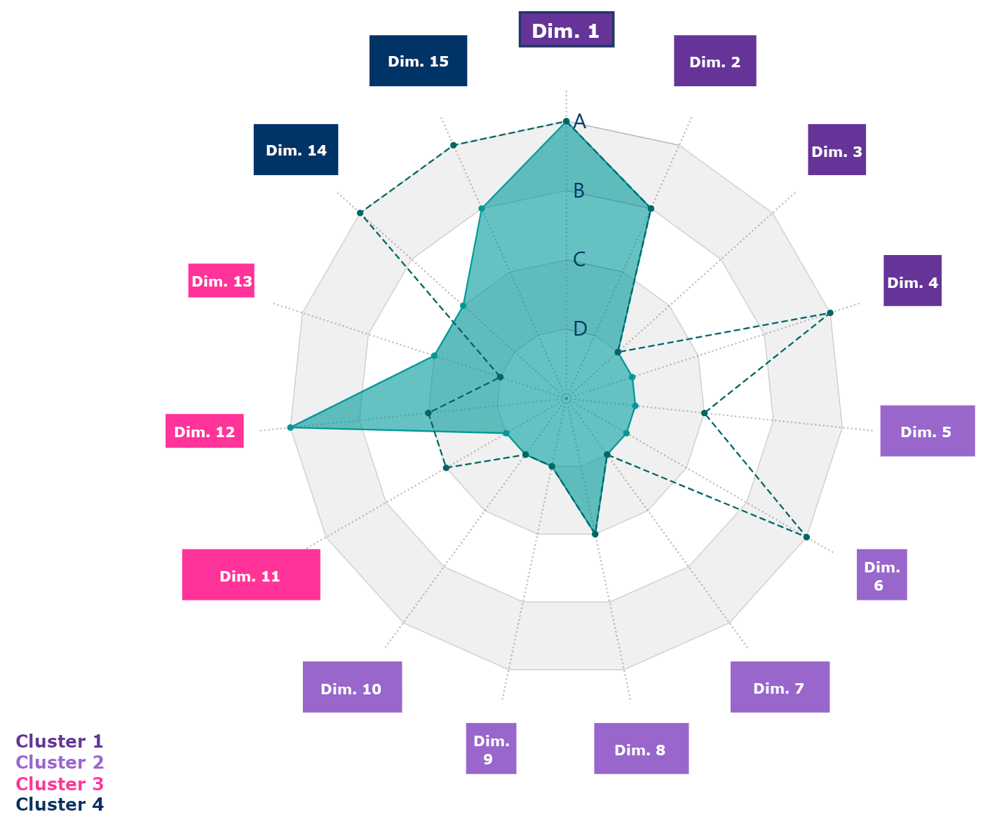
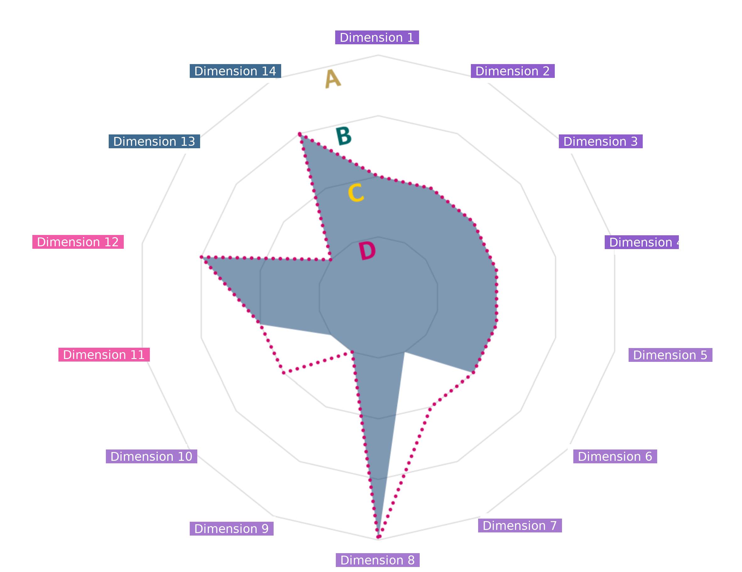
How much a structured process pays off became clear in a customer project that asked for a radar chart with 15 axes, grouped into four coloured clusters, showing the current year as a filled area against the previous year as a dashed line. A click on any axis was to filter the rest of the page, and the customer wanted to adjust colours, lines and labels without our help. Neither the built-in visuals nor any community solution came close. Three of these requirements turned into architectural decisions that had to be settled before the first line of code.
To give you a better idea of the result, we have rebuilt the principle with fictitious data:
Interactive example · fictitious data
How the radar chart from the project works
Click on an axis to “filter” by it. The filter stays active until you remove it – just like with the Filter API.
Click behaviour: The customer wanted a click on an axis to filter the rest of the page and stay active until removed. Power BI offers two mechanisms for this. The Selection API highlights across visuals but resets with the next click anywhere on the page, whereas the Filter API behaves like a slicer and persists. With persistence as the requirement, the Filter API was the natural choice. You can try out the difference yourself here:
Try it yourself
Selection API vs. Filter API
Choose a mode, click on a bar – and then anywhere on the empty report canvas.
Revenue by region
Total revenue
–
all regions
empty report canvas – click here
Simplified illustration with example values.
Clusters: The 15 axes belong to four clusters, each with its own colour band and label. Cluster membership and colours should be defined in the data tables, so they come from the model as a separate data role, not from manual formatting. Adding that role later would have meant changing capabilities.json, the data converter and the rendering at the same time.
Configurability: The customer wanted to adjust much of the visual on their own in the format pane: colours, line styles, labels. Several technologies such as Deneb (Vega-Lite JSON in a container visual) or HTML Content (HTML generated by a measure) are easier to implement, but come without a format pane of their own. So we built an SDK visual (Power BI Visuals SDK, TypeScript), which behaves like any regular Power BI chart.
| Approach | Effort | Own format pane | A good fit if … |
|---|---|---|---|
| Deneb (Vega-Lite) | low | no | the team maintains the design itself |
| HTML Content | low | no | a measure can generate the HTML |
| SDK visual (TypeScript) | higher | yes | business users should adjust it themselves our choice |
Even the best specification leaves room for one surprise. Ours were the labels for axes and clusters. Defined as categories, they became part of what the visual's query grouped by, and since they came from two unrelated tables, the chart sprouted duplicate axes. The DAX query in Performance Analyzer revealed the culprits at a glance, two extra columns in the grouping. The fix sat in the data roles, not in the rendering. Turning the labels into measures took them out of the grouping, and the axes fell back into place.
The final result holds up rather well. The finished visual picks up every central requirement of the mockup, and a generous set of format pane options lets the customer fine-tune every element down to the pixel.
Conclusion
The road from the customer's wish to a visual that fits it precisely was a short one, and not by accident. The specification, the early decisions and the query test removed most detours before they could happen. The good news is that nobody needs to be a developer anymore to build sophisticated custom visuals. But it certainly does not hurt to think like one and specify first, decide early, and prove the query before the rendering. The AI writes the code. The strategy still belongs to us.
Do you have a chart in mind that Power BI cannot deliver?
We support you from the specification to the finished custom visual.