scieneers
  • Story
  • Services
    • Services overview
    • AI for the energy industry
    • Large Language Models – Talk to your data
    • Expandable AI-Chat-Base
    • Get Azure through CSP
    • Microsoft Fabric Data Platforms
    • Social Impact @ scieneers
  • Workshops
    • Data Product Strategy Workskhop
    • Microsoft Data Strategy & Analytics Assessment
    • Azure Data Platform Proof of Concept
    • Microsoft Fabric: “Bring Your Own Data” Workshop
    • Power BI Training
  • Content
  • Team
  • Join
  • Contact
  • DE
  • EN
  • Menu Menu

Time Series Foundation Models in Practice

Data efficiency, transfer learning and robustness on real district heating data

Once a day, a heat producer has to decide how to run the plant for the days ahead. That decision rests on a forecast of the heat demand: four days in 15 minute steps, 384 values in total. The first day is what the plan is built on, the other three are a buffer in case the next forecast fails. An optimiser then decides which generation units run when. If the forecast is too low, the grid risks undersupply. If it is too high, heat is produced that nobody needs.

This post is about whether a new class of models, time series foundation models, can fulfil that forecasting task better than what runs today.

📑 Table of Contents

  • The starting point
  • What is a time series foundation model
  • The setup
  • Result 1: Chronos-2 is the most accurate model
  • Result 2: No training data needed 
  • Result 3: Robust, in two senses 
  • What we take away
  • Our impact 

The starting point

Two model families are relevant in production. A CNN-LSTM, a neural network trained on one grid’s own history, works well but needs two to three years of recorded data before it can be trained sufficiently. AutoARIMA, a statistical model that also uses the weather forecast, is what runs today. It needs no training dataset, only the last few weeks of data it forecasts from.

Foundation models promise more than either. Their authors present them as universal forecasters: usable on almost any real world dataset with minimal adaptation. So we asked two questions. Does that claim hold on real operational data? And would they actually beat the models in production, in accuracy, in reliability and in tolerance to faulty sensor data?

The short answer, with the caveat that this is an offline study: for one of the three models clearly, for one partly, for one not.

Back-in-time Back-in-time

What a time series foundation model is

The idea is familiar from language models. Instead of training a model from scratch for one narrow task, you take a model pretrained on an enormous and diverse corpus and apply it to something it has never seen. Time series foundation models apply this approach to forecasting. Pretrained on millions of series, they learn the general grammar of sequential data: daily and weekly patterns, trends, and how a series reacts to outside factors like the weather.

That pretraining is not purely abstract. LOTSA, one of the pretraining archives, spans around 27 billion observations, and about 59 % of them come from the energy domain. Our grids were certainly not in there, but other series that behave a lot like them very probably were.

Using such a model without any training on the target data is called zero-shot, and that is what makes these models interesting in low-data scenarios.

We tested three of them: Chronos-2 (Amazon), TimesFM-2.5 (Google) and Moirai-2 (Salesforce). Each was run zero-shot and after parameter efficient fine-tuning on the grid’s own data. Some variants add Xreg, a technique we took from TimesFM’s reference implementation: a small linear regression on the weather and calendar covariates, fitted to whatever the foundation model gets wrong. TimesFM-2.5 needs it to use covariates at all, because the model itself only reads the demand history. Chronos-2 can take covariates directly, so for it Xreg is an alternative route. Against the foundation models stood four baselines: AutoARIMA as the production reference, XGBoost as a strong machine learning model, a ridge regression (a regularised linear regression), and naive persistence, which just repeats the last known input value as a flat line. A model that cannot beat a flat line has no business being deployed.


The setup

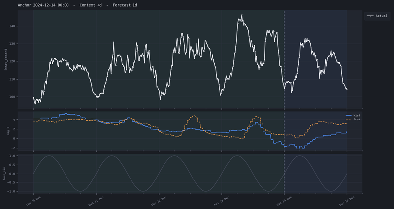
Diagramm mit drei Linienverläufen, die unterschiedliche zeitliche Verläufe von Messwerten darstellen

One example forecast window

The top panel shows heat demand over 4 days of context, then the forecast start (the anchor, dotted vertical line), then the 1-day forecast horizon (shaded). The middle panel shows outdoor temperature: measured values in the past and the weather forecast values given to the models. The bottom panel shows a calendar feature (a sine that encodes the time of day).

All models are offered the same input: typically 20 days of past demand as context, plus weather, calendar and holiday information for the past and the forecast period. We ran three experiments on real data from four district heating grids that differ strongly in size and behaviour.

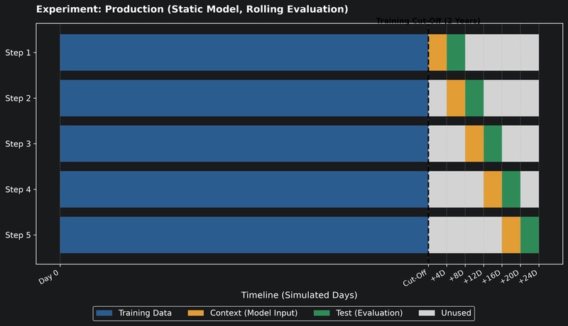
Balkendiagramm zur Produktionsvisualisierung mit fünf Schritten, das Trainingsdaten, Kontext, Testphasen und ungenutzte Zeit über simulierte Tage darstellt

How the production experiment is set up (not to scale)

The models are trained once on several years of data up to a cut-off; how many years depends on the history available for each grid. After the cut-off, a window steps forward in time, and each step uses a few days of context as input and the following days as the test period.

  • Production

    A head to head comparison under realistic conditions, 697 forecast windows across all four grids.

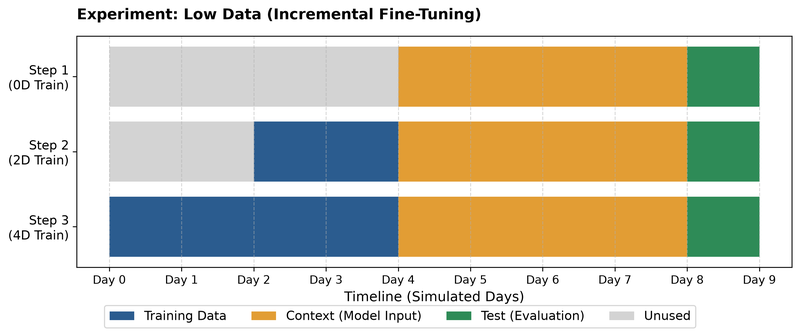
Balkendiagramm mit drei Schritten zeigt Zeitverlauf von Training, Kontext, Test und ungenutzter Zeit über neun simulierte Tage

How the cold start experiment is set up (illustration only, not to scale)

The model always gets just a few days of context, followed by an evaluation window. In front of the context, the amount of training data grows step by step, from none up to about 30 days in the actual experiment. This simulates a newly connected plant.

  • Dot-2 Dot-2

    Cold Start

    A simulated new plant with only 4 days of context and at most 30 days of training data.

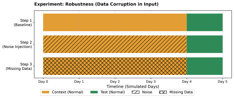
Balkendiagramm mit drei horizontalen Balken, die verschiedene Datenzustände (Normal, Rauschen, Fehlende Daten) über eine Zeitachse von Tag 0 bis Tag 5 darstellen

How the robustness experiment is set up

For each anchor, the same context and test window are used first with clean input (baseline), then with random noise added to the context, then with missing data in the context. Only the context is damaged; the test period stays the same for each anchor and is never altered.

  • Dot-3 Dot-3

    Robustness

    The same forecasts, with the input data deliberately damaged in different ways.

The headline number is MAPE, the mean absolute percentage error, which is also what the operators use day to day. A MAPE of 10 % means the forecast is off by a tenth of the actual demand on average. Since underestimating is worse than overestimating here, we also checked a custom business metric that penalises underestimation twice as hard, but it paints the same picture.

Result 1: Chronos-2 is the most accurate model

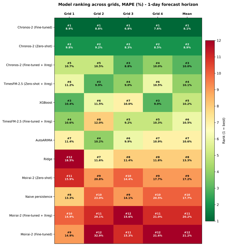
Heatmap zeigt Modell-Rankings über vier Gitter mit MAPE-Prozentwerten für 1-Tages-Vorhersagehorizont, farblich von grün (besser) bis rot (schlechter) mit Rangnummern und Mittelwerten.

Ranks the models and their variants on each of the four grids and on the mean, for the 1-day horizon

Each cell shows the rank and the MAPE. The colour shows the rank: green is better, red is worse. Lower MAPE and a lower rank are better.

Chronos-2 takes the top two ranks on every grid, first fine-tuned and second zero-shot. Compared to AutoARIMA that is 8.1 % instead of 10.6 % MAPE, about a quarter lower, and still 8.9 %, about a sixth lower, without any training on the grid at all. Xreg did not help Chronos-2, which reads the covariates better on its own. TimesFM-2.5 lands in a close middle field with XGBoost and AutoARIMA. Moirai-2 ends up around the level of the flat line.

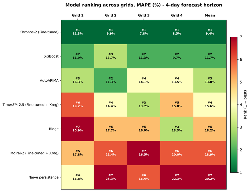
Heatmap zeigt Modell-Rankings über vier Raster mit MAPE-Werten in Prozent für eine 4-Tage-Vorhersage, grün markiert beste Ränge, rot die schlechtesten.

The same ranking heatmap for the full 4-day horizon, with a reduced set of 7 model variants

Lower MAPE and a lower rank (greener) are better.

For the full four days we compared a reduced set, one fine-tuned configuration per foundation model. Chronos-2 stays ahead: 9.4 % instead of 13.8 % MAPE, roughly a third lower than AutoARIMA.

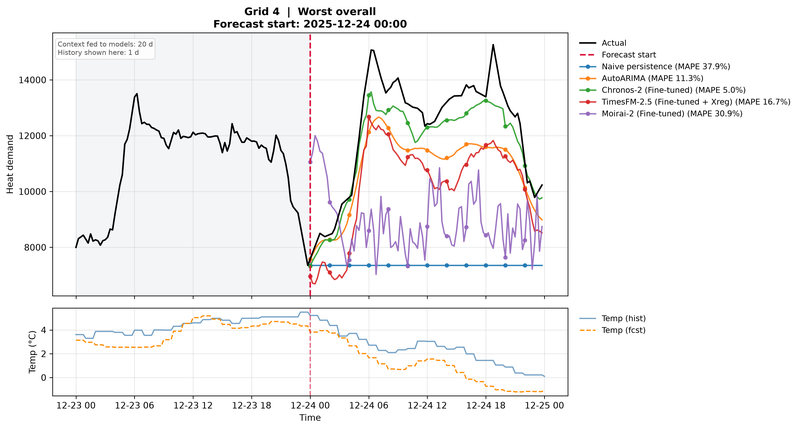
The hardest forecast day of the test period, Christmas Eve 2025 on Grid 4

The plot shows actual heat demand (black) against the 1-day forecasts of five models, with each model’s MAPE in the legend (lower is better). The lower panel shows measured and forecast temperature.

The worst day of the whole test period was Christmas Eve on one of the smaller grids, with demand far from its usual pattern. Naive persistence missed by almost 38 %, AutoARIMA by 11 %. Chronos-2 followed the actual curve at 5 %.

Result 2: No training data needed

Zero-shot is already enough to win. Without seeing a single day of the target grid’s history in training, Chronos-2 beats every baseline, including those trained on exactly that history. In the robustness experiment on a single grid with fewer test windows (see Result 3), the trained baselines Ridge and XGBoost even did worse than the flat line of naive persistence.

The foundation models still need data to forecast from, the recent context. What they do not need is a training dataset. That puts them on the same data requirements as today’s AutoARIMA, with a clearly better forecast.

Fine-tuning helps, but only with years of data.

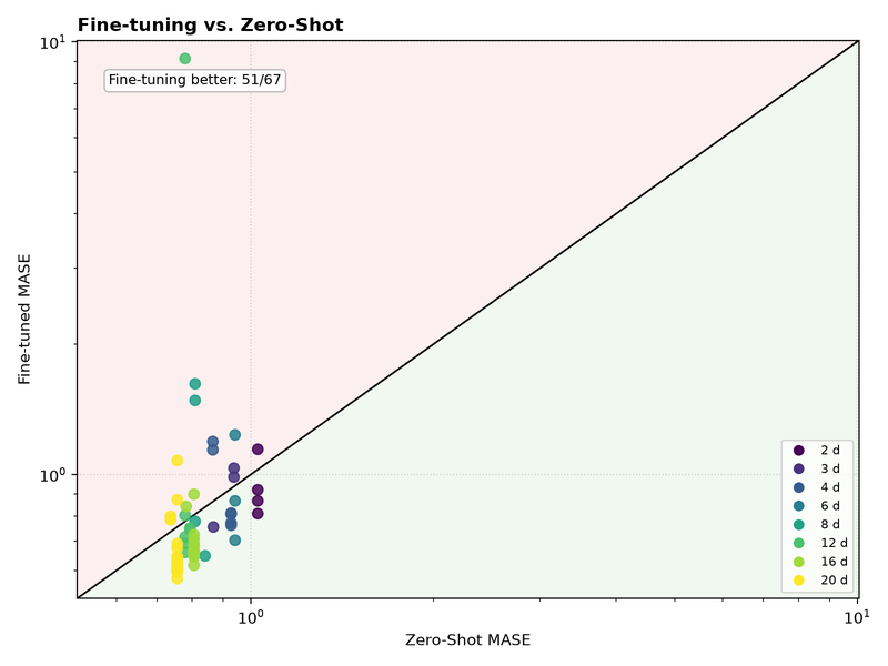
Streudiagramm mit logarithmischer Skala zeigt Fine-tuned MASE gegen Zero-Shot MASE mit farblich markierten Punkten für verschiedene Tage von 2 bis 20 und einer Diagonalen als Referenzlinie.

Zero-shot vs. fine-tuned error for each fine-tuning configuration from the Chronos-2 hyperparameter search, on log-log axes

Each point is one configuration, and the colour shows the context length. MASE: lower is better, and values below 1 beat simply repeating the previous day as the forecast. Points below the diagonal (green area) mean fine-tuning helped: 51 of 67 configurations.

With one year of training data, fine-tuning mostly made Chronos-2 worse, and the best settings were those that changed the pretrained parameters least. With two years, the picture flipped, which is the case shown above. Each point is one fine-tuning configuration from the hyperparameter search, compared with the zero-shot model on the same validation data; the colour is the context length the model was given, not the amount of training data. The error here is MASE, the error divided by that of a forecast which simply repeats the previous day, so any value below 1 beats that simple rule. 51 of 67 configurations improved over zero-shot (points below the diagonal), the best one by around a quarter. One ended up more than ten times worse, a reminder that fine-tuning can also go badly wrong. In the production comparison the gain was smaller, from 8.9 % to 8.1 % MAPE. At the other end, the cold start experiment showed that 7 or 30 days of training data do not help the model improve at all.

The data efficiency comes from pretraining, not from adapting on a few weeks of data, so a new grid can be onboarded almost immediately. Fine-tuning is worth it only where years of clean history already exist.

Result 3: Robust, in two senses

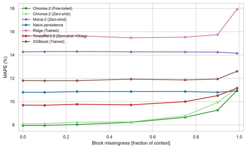
Faulty sensor data. We removed up to 99 % of the demand history the models receive as input. For most models the error barely moved. Chronos-2 reacted most: from 8.0 % to 11.0 % MAPE, which at 99 % missing input leaves it level with the naive persistence baseline (10.9 %).

Liniendiagramm mit mehreren Kurven, das MAPE in Prozent gegen Blockfehlmengen als Bruchteil des Kontexts darstellt

Forecast error (MAPE) for each model as a growing share of the demand history is removed in blocks, from 0 to 99 %

Lower is better. A flatter line means the model is more robust to missing data.

The reason is the weather data, which we left intact: it carries so much of the signal that the models can reconstruct most of the daily profile from it. That mirrors a realistic failure, a heat meter dropping out while the weather service keeps running, but it also makes the result optimistic. Interestingly, Chronos-2 was the most sensitive to damaged input, simply because it gets the most out of intact input. Even so, it stayed among the best models under every kind of damage, including random noise. AutoARIMA is missing from the plot: because it is CPU-bound and refits for every forecast, it introduces a significant computational bottleneck. In a separate, smaller run, Chronos-2 stayed ahead of or level with AutoARIMA at every level of damage.

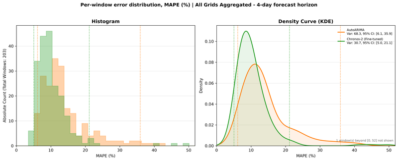
Reliability in operation. A good average is useless if a model is excellent on most days and catastrophic on a few, since a plan has to be made every day.

Zweigeteilte Grafik mit Histogramm links und Dichtekurve rechts, die Fehlerverteilung (MAPE in Prozent) für 4-Tage-Vorhersagen verschiedener Modelle zeigt.

Distribution of the MAPE for every 4-day forecast across all grids (203 windows), for Chronos-2 (fine-tuned) and AutoARIMA

It is shown as a histogram (left) and a density curve (right). Dotted lines mark the 95 % interval (2.5th to 97.5th percentile). A distribution further left (lower error) and narrower (less variance, fewer very bad days) is better.

The plot shows the MAPE of every four-day forecast across all grids. Chronos-2’s errors are much more tightly bunched than AutoARIMA’s, with far fewer very bad days: 97.5 % of its forecasts stay below 21 %, against 36 % for AutoARIMA. It was also the most consistent across the four grids.

Running cost. AutoARIMA refits itself for every forecast, at about a minute each, and can fail to converge in rare cases. The foundation models produce a forecast on a GPU in a fraction of that, with nothing to refit.

What we take away

  • The universal forecaster claim is not a guarantee. It held for Chronos-2, partly for TimesFM-2.5, and not for Moirai-2.

  • New grids can be onboarded without training data, with a markedly better forecast than the model currently in use.

  • Fine-tuning pays off only with two or more years of history. Below that, use the model as it comes.

  • Next step: shadow operation. Run Chronos-2 alongside the production models on live data, with AutoARIMA as a familiar fallback. An offline study is evidence, not proof.

Some limits apply: robustness, hyperparameter optimisation and cold start were tested on one grid only, the weather data was never damaged, and the field moves fast. All three models received major updates during the study.

Our impact

BeOpt is an established production system for Iqony Energies, covering sensor data processing, forecasting and dispatch optimisation for a heterogeneous set of district heating grids. For this study, the existing platform supplied the cleaned data. Everything else, from preprocessing and model integration to the experiment framework, evaluation and every figure in this post, was built for this purpose and can now answer questions well beyond the ones asked here.

If you are working on forecasting in energy systems, or wondering whether foundation models are worth testing on your own time series, get in touch.

This article is based on the master’s thesis “Transfer Learning for Heterogeneous District Heating Grids: Evaluating Data Efficiency and Robustness of Time Series Foundation Models”, written at scieneers GmbH in cooperation with Karlsruhe University of Applied Sciences.

Author

Severin Hotz, Data Scientist at scieneers GmbH
severin.hotz@scieneers.de

© Copyright scieneers – Impressum | Datenschutz
Scroll to top Scroll to top Scroll to top